


Photo by Brett Jordan on Unsplash

Authors spend A LOT of time fretting over how their books look.
What font(s) should I use? (Did you know that not all fonts can be used in/on commercial products, such books?) What spacing should my paragraph indents be set at? Should I use this fancy graphic or that amazing photo at the end of my chapters? The list goes on and on.
I’m here to tell you that none of those things matter.
Don’t get me wrong. A book’s format/design should look clean and professional. But, I can say with absolute certainty that font selection or indents will not help you one bit when it comes to selling more books. (And, if you choose the wrong font without paying for it, you could get sued.)
Here’s what really matters:
- Good information (if the book is non-fiction) or a good story (if the book is fiction).
- Proper editing (well-written, concise writing that is free of grammar and spelling errors.).
- A professional cover.
Often, authors do a lot of crazy formatting before they submit the manuscript for publication. And, by doing so, this can cause delays and extra (unnecessary) expenses. Here’s why.
Just about every self-published book, and many traditionally published ones now, are manufactured through a process called print-on-demand. The book exists simply as a digital file. When a customer places an order for the book, that digital file gets transmitted to a digital printer, and voila, out pops a physical book. Digital printers have primarily replaced traditional printing presses, and you can’t tell the difference between the books at all.
When you hire a company like BookLocker, you are paying for experienced professionals to take the manuscript and turn it into an attractive, professionally designed digital file. That includes interior formatting/design, original cover design, and much more. The printer’s requirements are often at odds with any file settings or fancy formatting contained within the original manuscript. Bottom line: All of that fancy formatting has to be stripped out or re-engineered. It’s always best to let the professionals handle that part of the publishing process.
Moreover, ebooks (Kindle, Nook, iPad, etc.) have entirely different formatting requirements. When the manuscript gets to this stage, any complex formatting also has to be completely undone. Otherwise, the text of the book will not display correctly on the various ebook reading devices. Companies like BookLocker handle that part of the project as well.
I also need to caution authors to not hire different companies or individuals for different parts of the design/publishing process. That often costs thousands more than simply having one firm assist you. And, chances are, since your book hasn’t been published yet, that person won’t know your future printer’s specs.
Recommend reading:
Do NOT Hire a Designer BEFORE Choosing a Book Publisher!
Take Away Points:
- Keep the format of your book simple.
- Focus your energy on the writing writing process. If you’re not an expert at interior formatting and cover design, leave that to the professionals. Otherwise, your end product (your book) will look self-published. You want your book to look as professional as traditionally published book do.
RELATED
- AUTHOR ALERT! The Traditional Book Publishing Industry is DYING FAST!
- Authors! Crummy Covers Crush Clicks!! By Richard Hoy
- Your Book Is Too Long (And Here’s Why That Matters) By Richard Hoy, BoostABook.com
- Want More Readers? Start With Researching YOUR COMPETITION! – by Richard Hoy
- When Your Computer Ruins Your Online Marketing Activities By Richard Hoy
Why Should I Listen to Richard?
That’s a darn good question. Why should you listen to Richard?
Richard is the rarely-heard-from co-founder of BookLocker.com. He’s been in the self-publishing industry since 1999. Four years before that, he started his career in online marketing (just as it was becoming a formal profession). You can read the whole story of Richard’s career at JoeGrape.com. When he isn’t shelling out online marketing help, he is planning off-road motorcycle trips.
Richard has more blunt self-publishing advice for WritersWeekly.com readers in the coming weeks. Stay tuned!
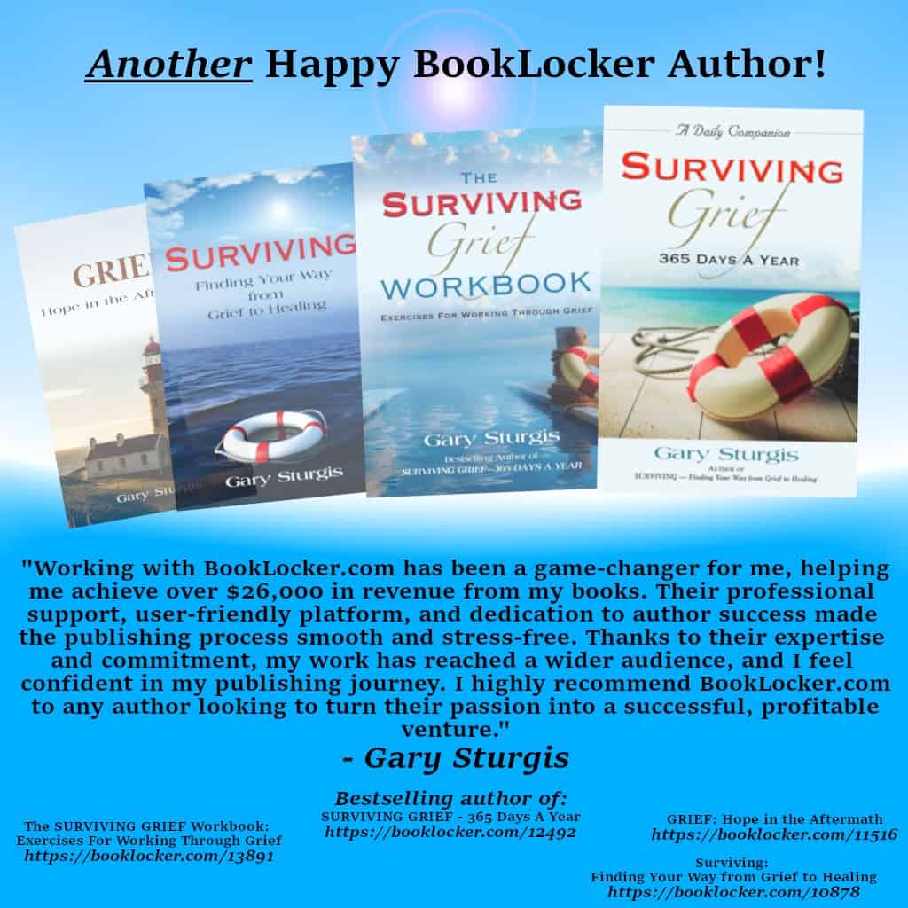


Good advice, especially ‘Do not hire a designer before choosing a book Publisher’. BookLocker does a great job formatting and correcting errors. If I run into a new writer, I recommend BookLocker and tap into WritersWeekly, and let them make their own choice about publishing their books. Over-formatting can make your work look cluttered or unreadable.
BookLocker did a great job in formatting my book and correcting errors. They were great to work with and very professional. The result was much better than I expected. I highly recommend them.
Love ya, Antaeus! 🙂
Angela